National Center for Development & Diversity's 'Faculty Success Program' Platform
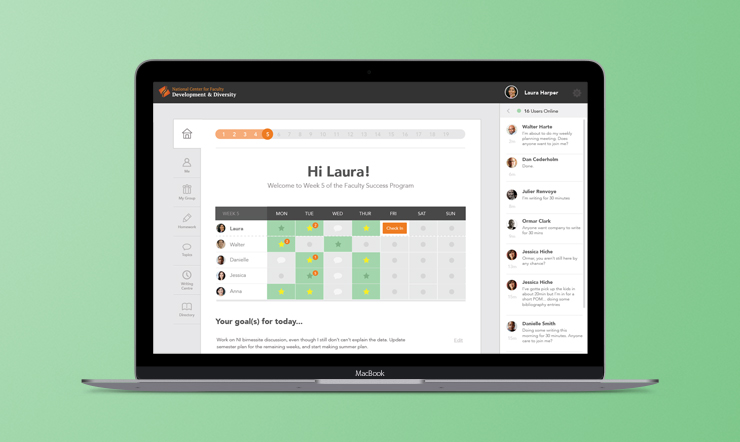
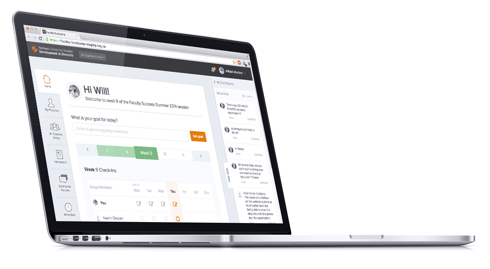
The Faculty Success Program is a platform designed to help graduate students and junior faculty achieve tenure-track positions. It harnesses empirically-tested methods to improve productivity through accountability, coaching, and peer support.
My Role
Product Management & UX Design
Project Team
Visual Design: Martin Miskelly
Dev Lead: Derek Watson
F/E Dev: Mark Appleby
Dev: Brian Gilham
Proudly made with TWG
Focus on what matters
Aspiring professors typically spend the bulk of their time on teaching and service, but not on writing and publishing original research. It’s easy to focus on the academic duties that you’re actively held accountable for, but it’s hard to find the time to focus on personal research, winning external grant money, and publishing research that are essential when being considered for tenure.
"The Faculty Success Program has allowed me to enjoy becoming a new dad without missing a beat in my research and writing."
Jeremy D. Brown, PhD
Discovery
In order to gain a better understanding of the target audience, I kicked the project off by interviewing former students to determine how they write, what challenges initially led them to take part in the Faculty Success Program, key takeaways from the program, and where they saw opportunities for improvement.
It's very motivating to see that others with busier lives than mine are able to write so much each day.
Both the affirmations and the competition are important - I like the motivation of seeing others succeed, but also the support and recognition you get that ‘hey, everyone is struggling with this. It’s ok’.
I don’t like forums - I’d prefer topics or some cleaner way to have discussions in a room.
I need a better integration between semester, weekly, and daily planning - so I can see progress against my goals.
Value-driven design
The user interviews and discovery sessions suggested a set of high-level product design values:
- Reinforce the writer's feeling of productivity,
- Remove the sense of isolation that writers can feel,
- Build a community that fosters emotional, human connections,
- Balance affirmations and support with the clear reporting of data surfacing of trends among the group.
In short, users should feel good with each log in, even if their own projects are causing them distress. Referencing these values, I then defined key personas and value props for each audience (writers, coaches, and admins), and core user flows.
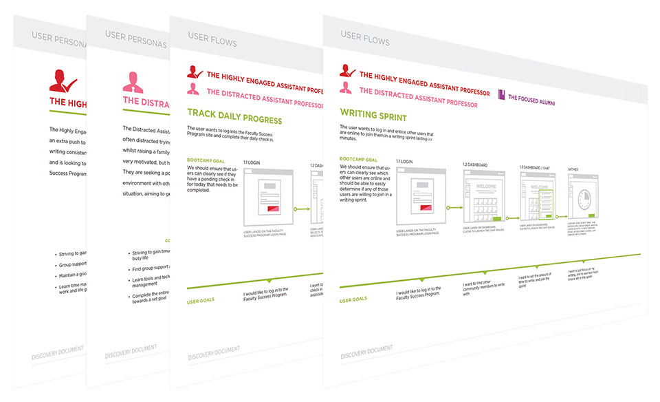

With the key flows defined, I directed the team through the lo-fi wire framing. This allowed us to get a functional prototype out for user testing, so that we could collect feedback, validate our assumptions, and ensure that we were focusing on the most important functionality.


In parallel, we built up the design system and the UI elements, which we would then marry to the functional design once we ran through a few more iterations with our user testing group.
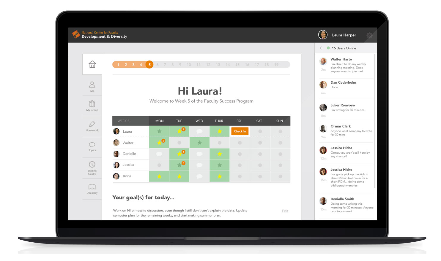

This process of using wireframes to discuss the details of the app functionality and the style-tiles and key screen mocks (with responsive break-points) to discuss visual design proved to be a valuable way to parallelize the team’s efforts while keeping client reviews focused.
Building it out
We learned a number of important lessons in development, including the complexity of multi-room real-time chat functionality (pre-Slack), and the iceberg that can be threaded commenting and conversations that fire notifications to multiple users with varying permissions.
Once we have a functional beta version, we allowed our small group of pilot users into the new platform. We spent a few weeks collecting feedback through the in-app chat functionality - very convenient to build in a core feature that facilitates real-time user feedback.
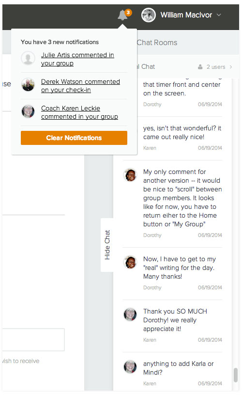

Write Now
The inclusion of a writing timer came directly out of the early user interviews. Users can find their peers through the global chat, initiate a joint timed writing session, and then check in with one another after the time is elapsed. Users loved the feeling of solidarity that this enabled.
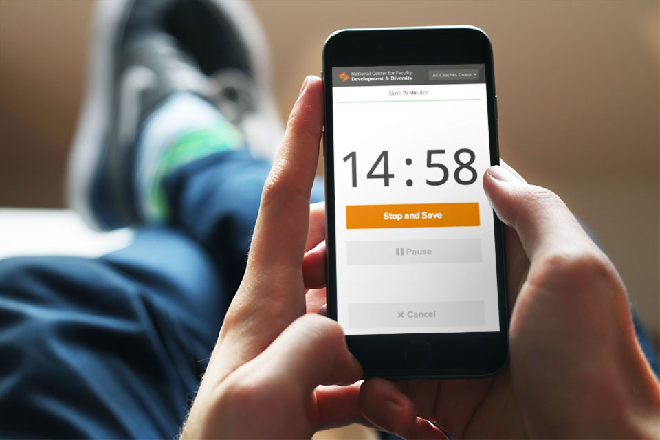

When active, the timer takes over the browser window facilitating concentration on the writing task at hand. Once complete the time is automatically logged against a user’s writing time for the day. Having the companion writing timer really changed the fundamental way that users were relating to the software. Previously the focus was on retroactive reporting, but now it becomes to an active assistant that you begin to rely on and have running while doing your work. For a subscription-based service, this meets a key business goal of building in user retention.
Key Takeaways
This product allowed an amazing opportunity to actively collaborate with a passionate user group through the iterative design and development. From early interviews to repeated testing sessions and feedback collection, the strong trust we had from our client and the relationships we built with the program participants helped shaped the product in countless ways and really re-inforced the fundamental value of user-centered design and agile product development.
It was also very satisfying to have an opportunity to develop a product which had such an immediate, positive influence on the lives and careers of so many people, and to be able to hear about it from them directly.
NEXT PROJECT
Reigo & Bauer
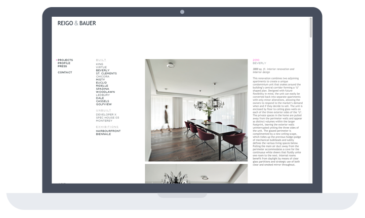
A clean portfolio site for a pair of modernist architects.
