Wikiwash
My Role
Product Management & UX Design
Project Team
Design: Liam Thurston
Dev: Jacob Moeller
F/E Dev: Alejandro
Proudly made at TWG
Discovery
Wikiwash was born at TechRaking Toronto, the conference for data in the newsroom hosted by the Centre for Investigative Reporting, Google Canada and The Canadian Press.
The winning team from Metro News received two weeks of TWG's time to help them bring their idea to life. Two weeks is an insanely short period of time to translate an idea into a functioninal public app. I helped the team hit the ground running by first distilling the core of their idea through workshopping and leading a Lean Canvas exercise.
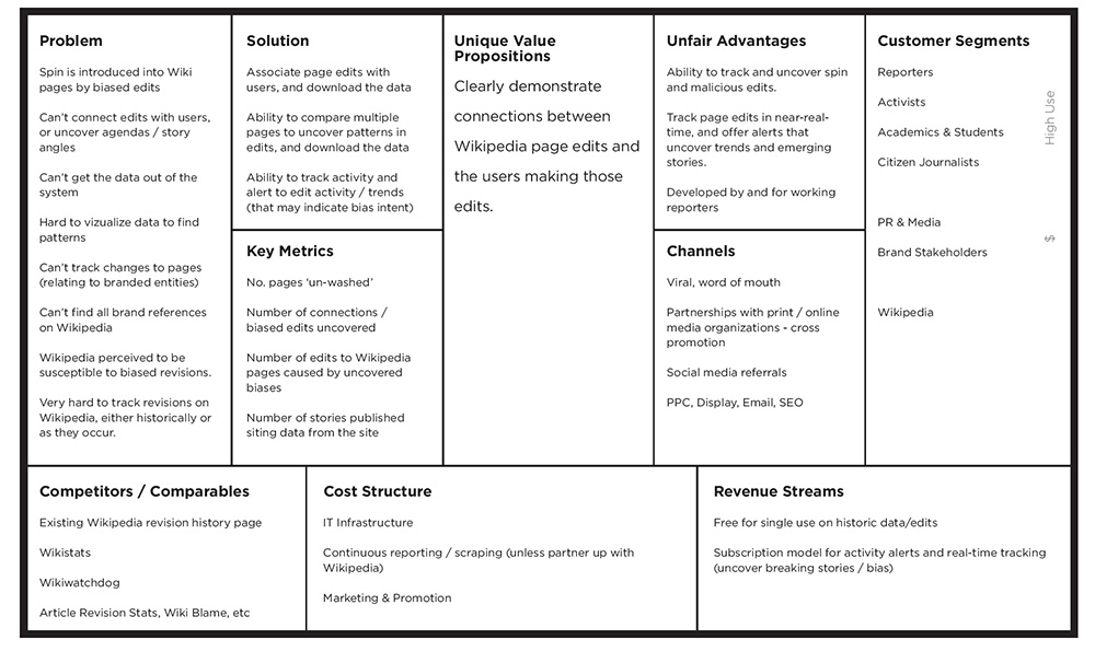

We then determined the core value proposition for each of our target segments, that would help guide us in making future product decisions:


Armed with a clear direction, we dug in for a busy first week of research and design. It quickly became clear that there were already many similar tools on the market, which I studied in detail.


From this competitive analysis, I extracted a series of lessons:
Most products suffer from information & feature overload, with a steep learning curve.
Simplify
Most products suffer from terrible UI & challenging UX. There's a lack of documentation, and the products are not goal oriented.
Clarify
There is a lack of information hierarchy, and it is difficult to quickly pull out important data.
Expose patterns in the data
Most product only offer historic data only (no active reporting).
Active reporting & trend analysis
"It’s imperative reporters have tools to find the stories hidden in the data."
Luke Simcoe, Metro News
For our MVP, we initially decided to build a tool that would be a record of page edits, and parse it into a simple database that stores:
page | original text | edited text | time stamp | user
Once we have that data, we can show it off in any number of ways. We proposed demonstrating the power of the system in this MVP through a few limited examples, without overwhelming users with details or inputs.


As we dug into the MediaWiki API, we discovered that it limits the maximum number of records per call to 500. Additionally, the desired API call for our proposed MVP app (a list of edits by contributor) was not directly available. So, pivot time..
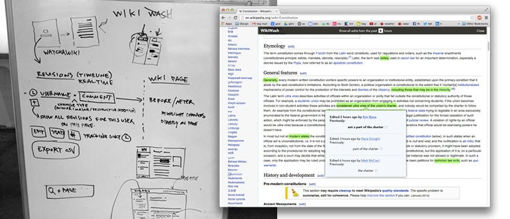

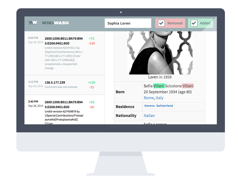
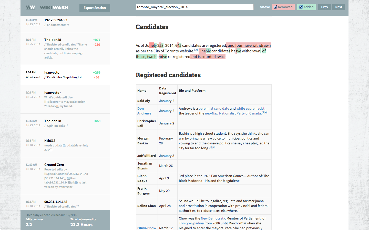
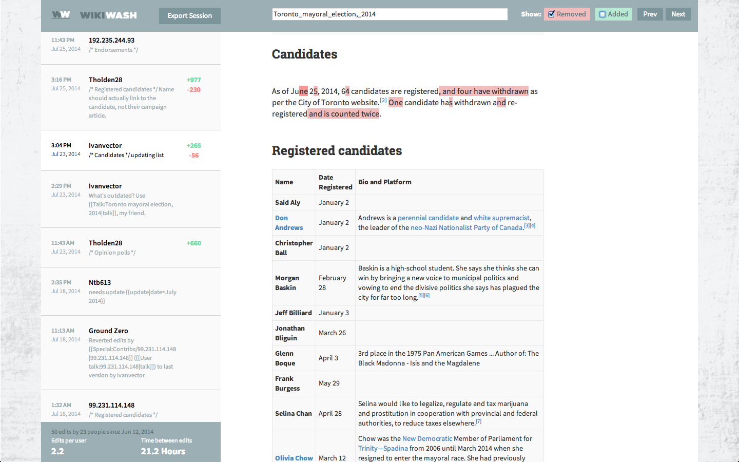
Taking it back to the drawing board we discovered that by taking the difference between two page states at two different points in time, we can expose the edits on a page in real time. This speaks to one of the early stated value propositions of the ideal app, to track edits and surface trends in real time.
We also discovered a way to show the edits on the actual Wikipedia page content (instead of just listing the edited snippet in a list), so we can show the edit in context. Big win. This launched us into our week of final design production and parallel development.
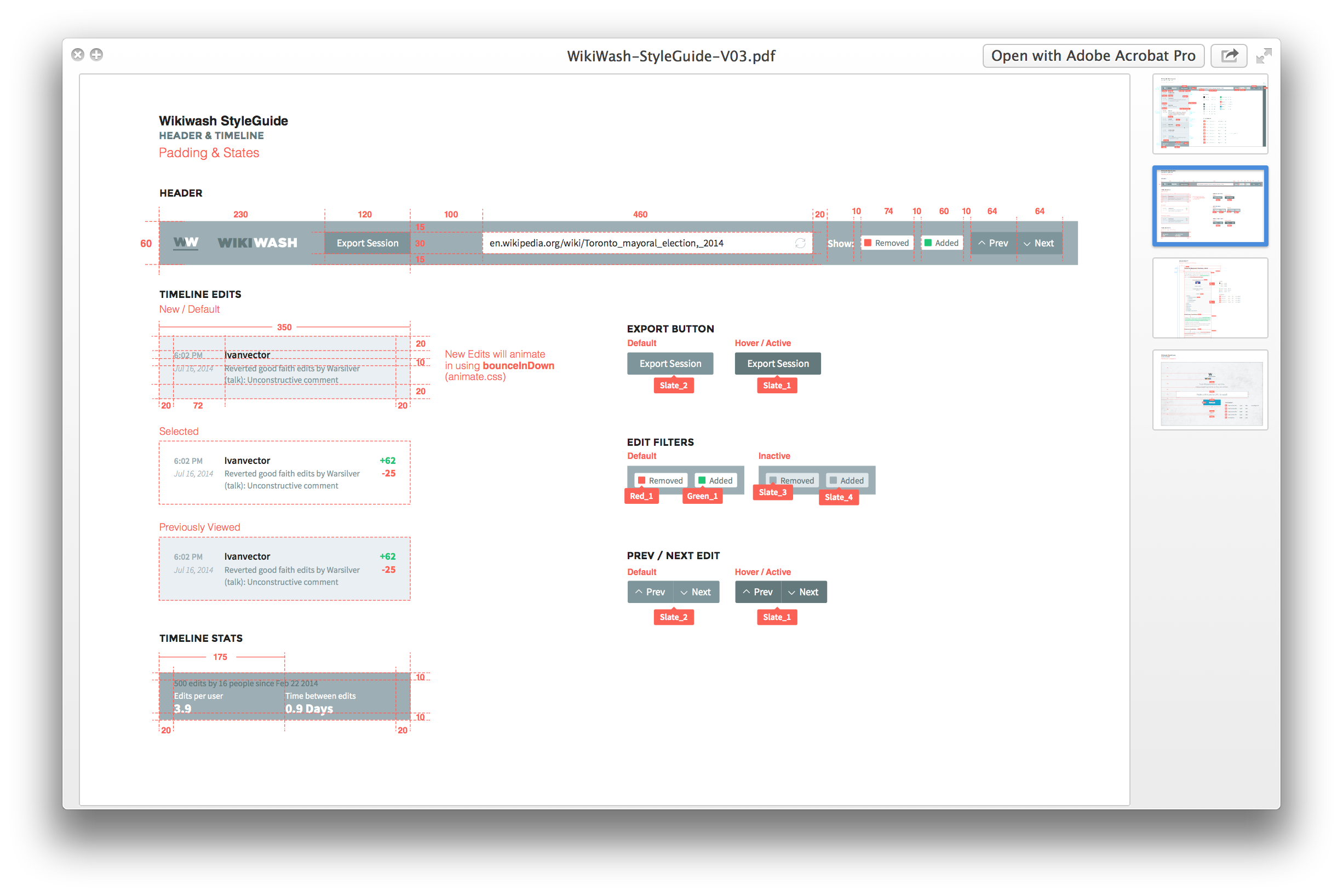

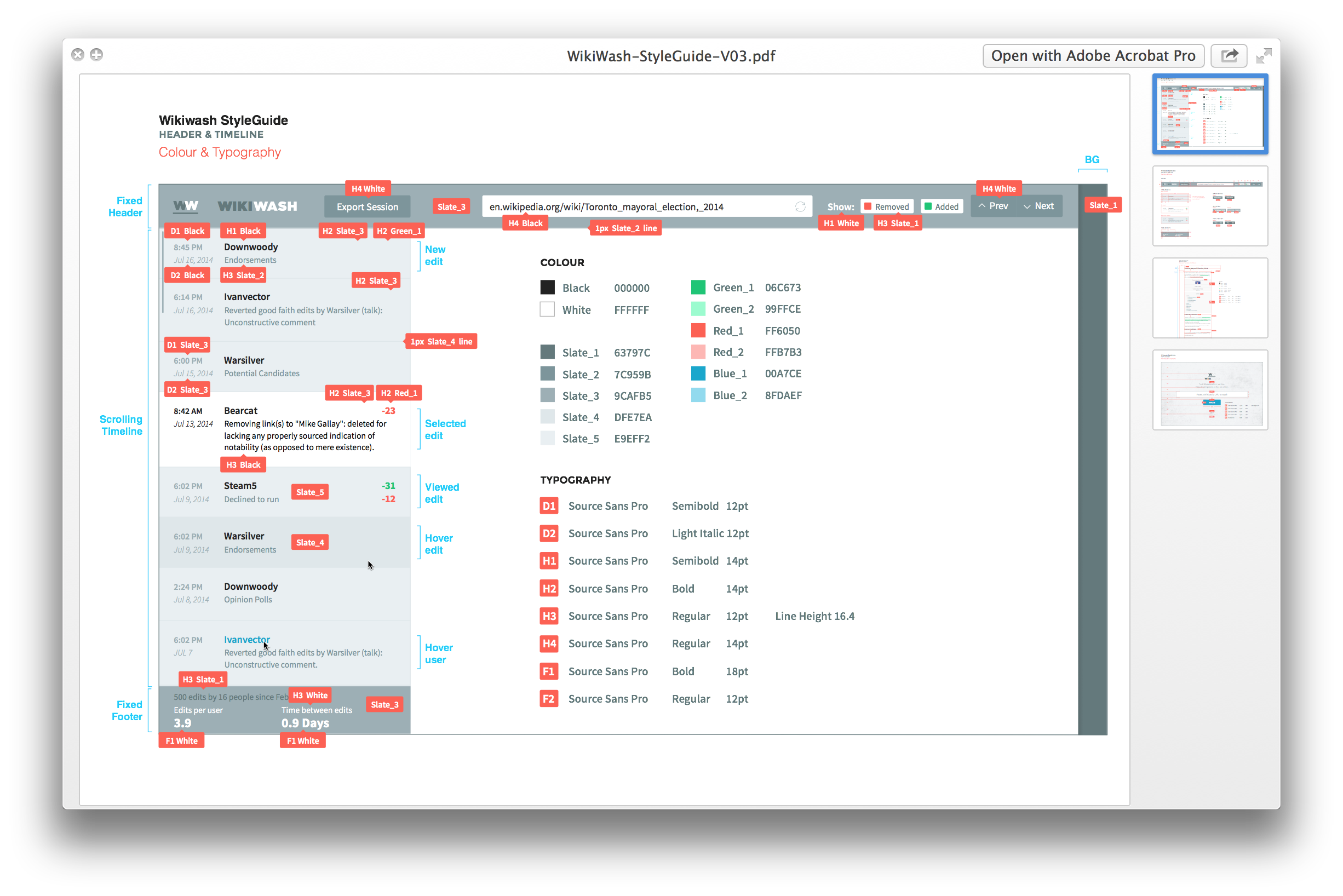

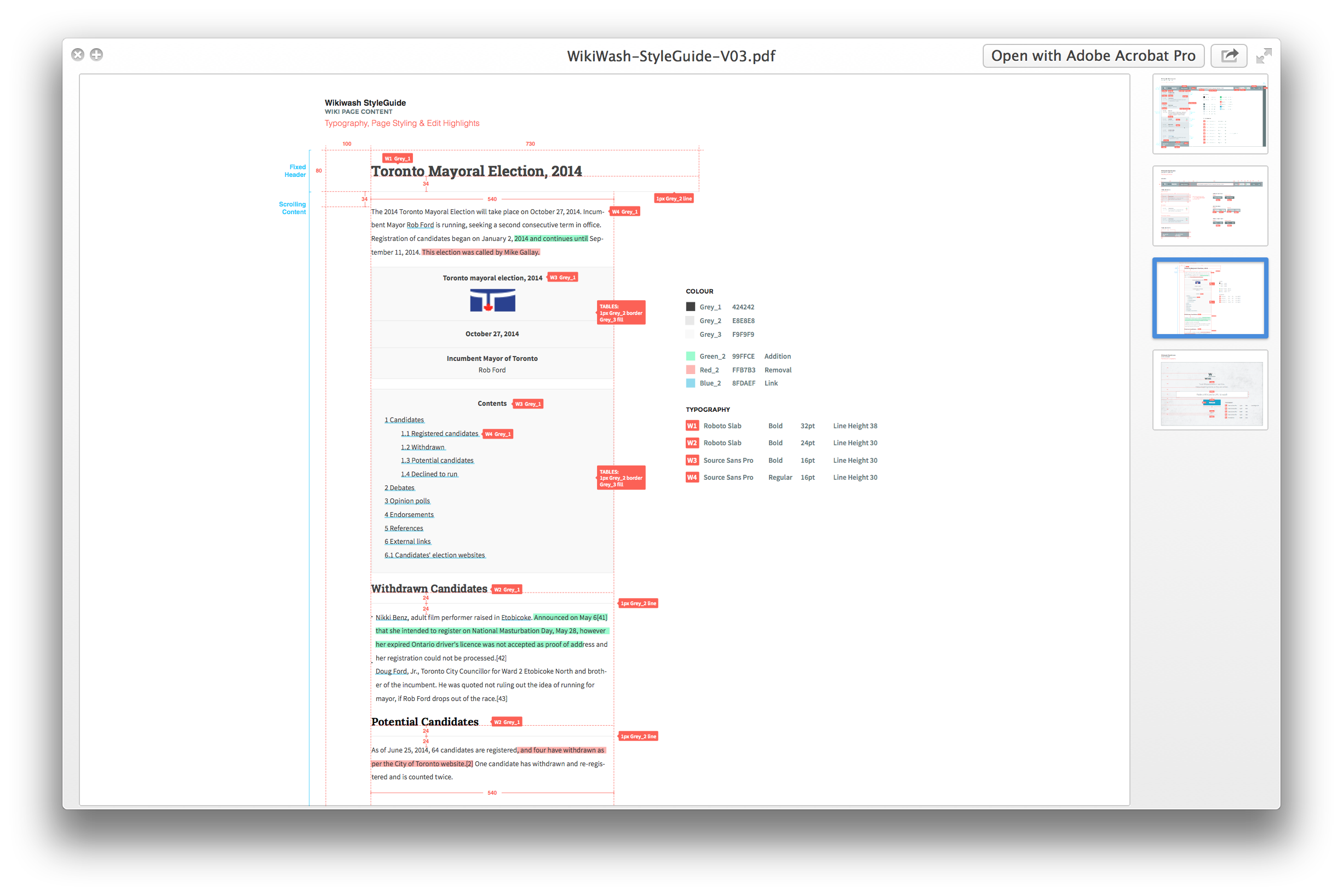

Project Style Guide
(created by Liam Thurston)
One fun result of the way we were going to be rendering the diff'd results is that we could essentially reformat the Wikipedia page layouts. Everyone and their cousin has taken a shot at redesigning Wikipedia page layouts, and our design lead Liam got excited to try his hand at it too. We couldn't deviate too greatly from the source layout, but Liam did an amazing job refining some of the base themeing. Jacob pulled apart the MediaWiki API and got deep into Node.js to make sure that everything worked smoothly, while Alejandro made sure that the edit tracking was showing up beautifully.


The Launch
In the end we pulled it off, and had a fully functional proof-of-concept at the end of two weeks. TWG even open-sourced the project, so that the larger community can pick it up and iterate on what we started. WikiWash is a complex tool built to solve a very simple problem – viewing changes in Wikipedia, one of the world’s largest and most popular websites.
NEXT PROJECT
Homewood Health
A responsive custom CMS and mobile-first design & content strategy
