Liberty Utilities
Liberty Utilities provides gas, electricity, and water to customers across numerous states in the USA. TWG was engaged, in collaboration with PilotPMR, to provide long term strategic recommendations to improve both their technical infrastructure and their customer-facing digital service offerings.
As product manager, I led the team in developing a strategic plan designed to provide a richer web-based customer experience, increase internal corporate efficiency, and facilitate future growth. This work then rolled into a fast-follow to implement a series of quick wins on their existing public site, to deliver immediate improvements to their customers.
My Role
Product Management & UX Design
Project Team
TWG
Visual Design: Jessica Hoang
Dev: Stephen Leroux
F/E Dev: Haris Mahmood
Pilot PME
UX Director: James Beardmore
VP: Alex Mangiola
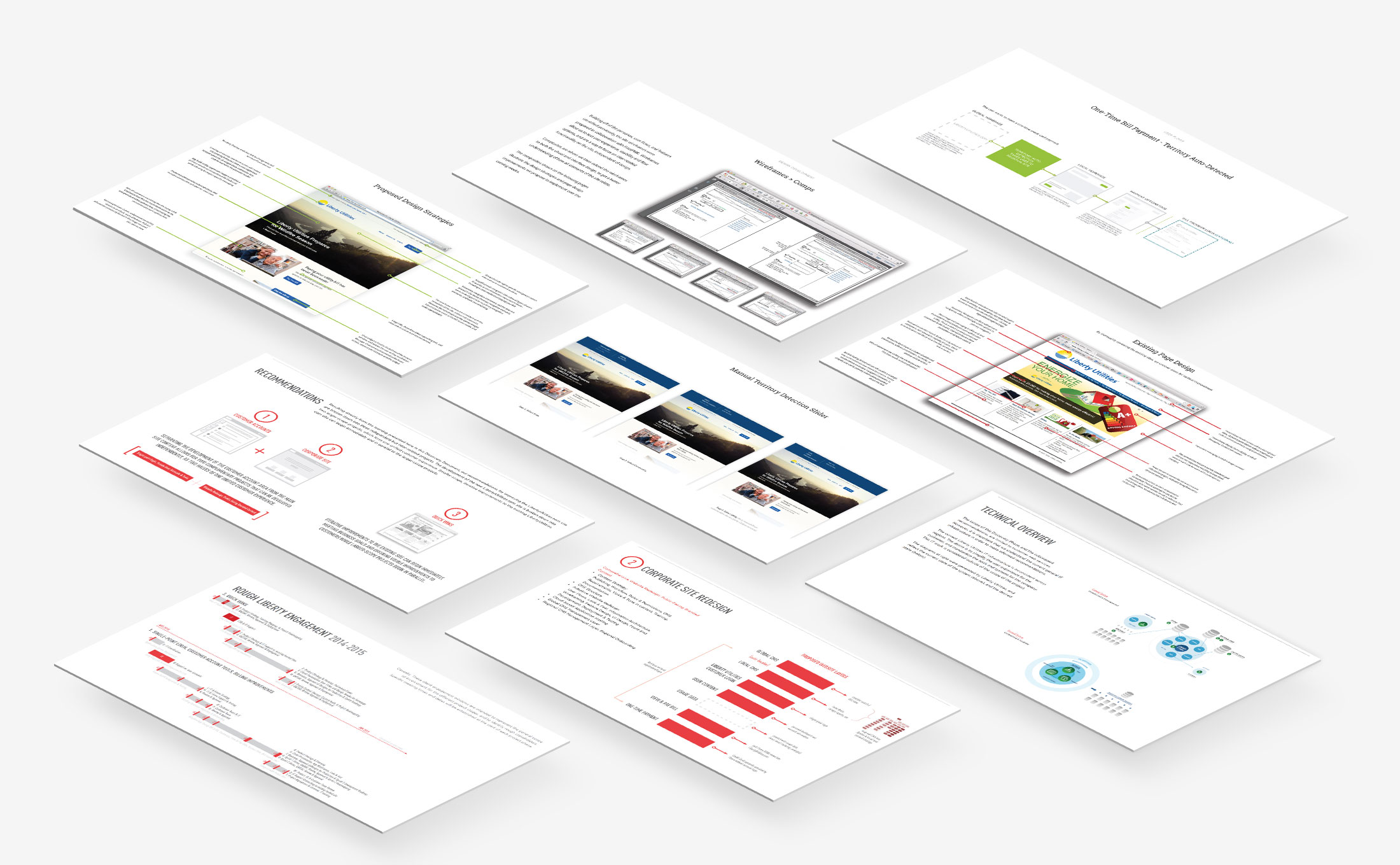

Discovery
Liberty Utilities' corporate growth is a result of the incremental acquisition of smaller regional utility companies. This was manifest in a complicated digital infrastructure (metering, billing, account management, payment, static info-site pages, etc) which was arduous to maintain and hard to scale. Customer web services were also challenging to access, and varied between states and utilities.
I led the technical discovery and research for this work, beginning with internal stakeholder workshops and market research analysis. In parallel, PilotPMR conducted extensive usability research including heuristic analysis and client surveys, and we collaborated on a content audit and analytics reviews in order to build up a clear picture of the current state of affairs. From there we could break down the opportunities and develop a series of longer-term strategic recommendations.

Recommendations
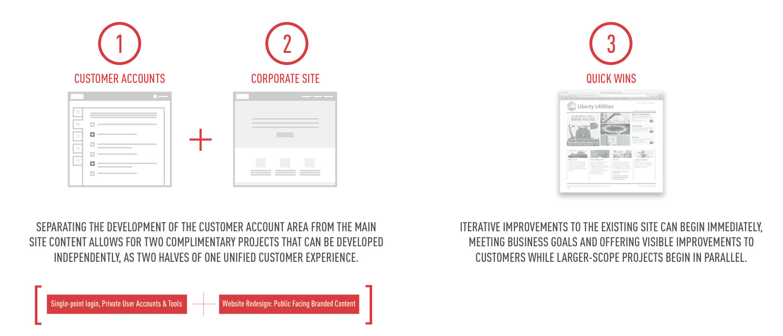
Our specific recommendations remain confidential, but in general terms we proposed three independant but inter-related projects. The development of the new LibertyUtilities.com site was broken down into the distinct public (info-site redesign, CMS development, content strategy, etc) and secure (client account info storage & access, client dashboard, billing & payment infrastructure, etc) project streams.
Separating the public content from the customer account tools allows each platform to be developed and maintained independantly, while forming a unified customer experience with many shared design elements.


Additionally, a third project stream including smaller-scope, iterative improvements to the existing LibertyUtilities.com site could begin immediately and in parallel to the larger-scope projects to address the largest identified customer painpoints.
Quick Wins
As a result of this strategic plan, we were engaged to begin with the 'Quick Wins' portion of the project while the longer term projects were spun up.
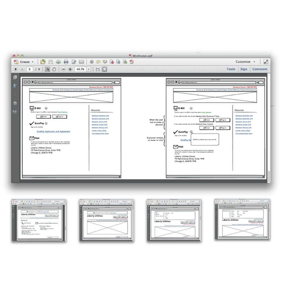
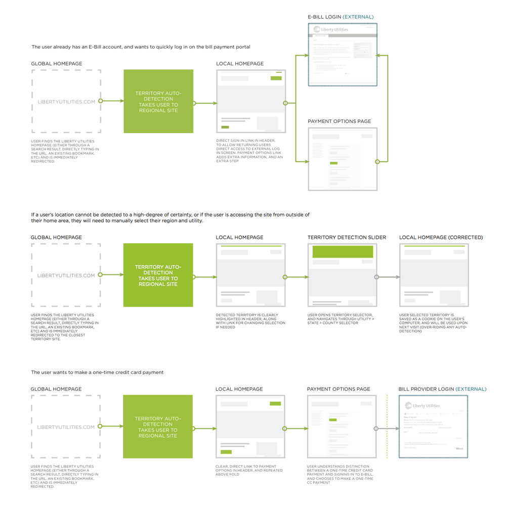
Building off of the previous discovery work, I mapped out core user flows and led the team quickly through wireframing and visual design. Our key tactical improvements included automatic GeoIP territory (& utility) detection, UX improvements including emphasized & simplified bill payment flows, and basic page templating to increase content clarity & consistency.
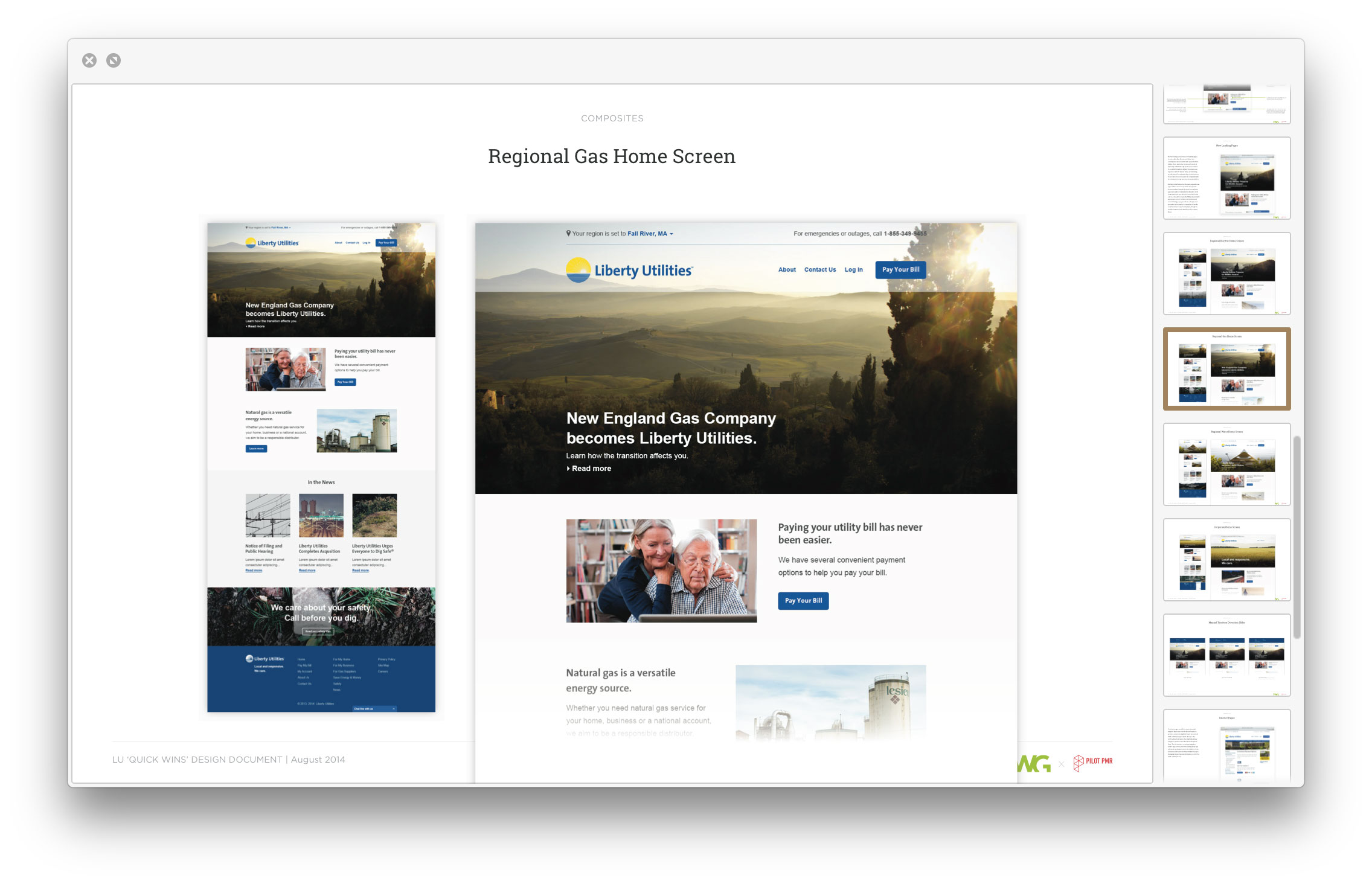

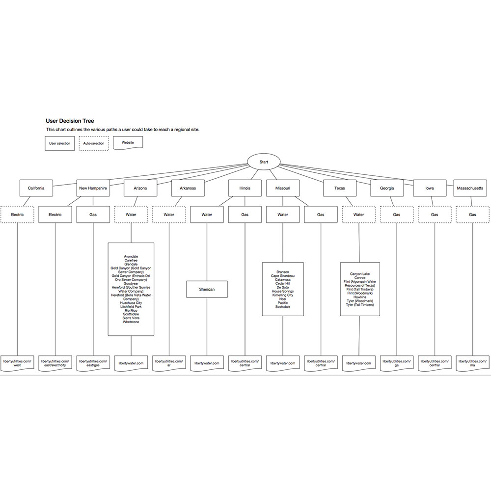



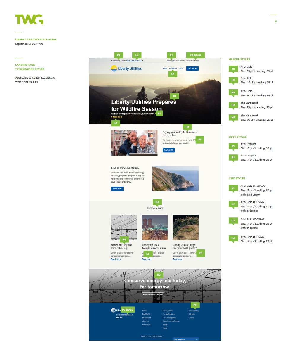

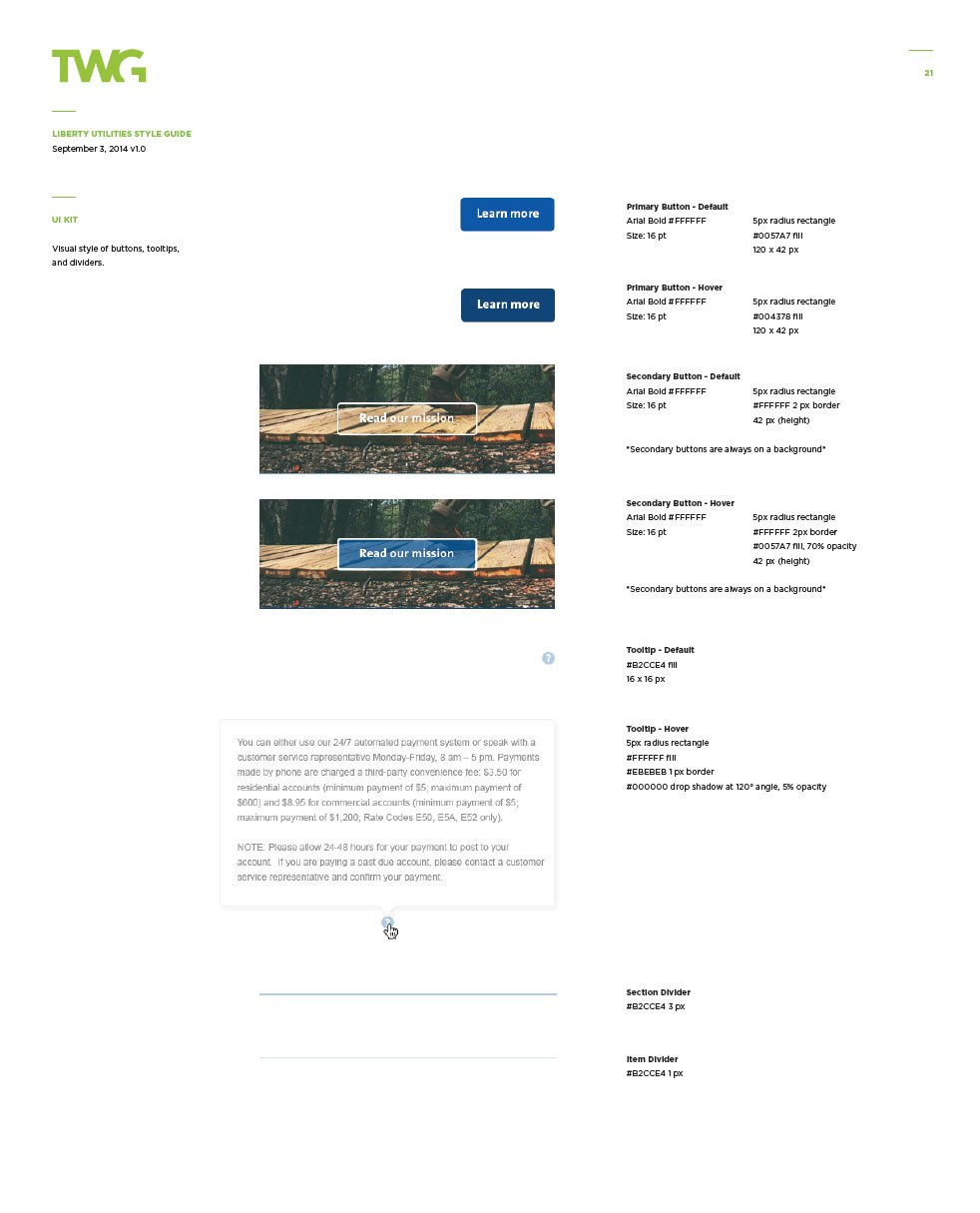

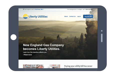
We produced new landing pages for each utility (Gas, Electric, and Water), in a contemporary and consistent style. These new home screens were focused on improving usability through the clear presentation of essential information, aligning the primary user experience with the brand’s values, and indicating the automatically-selected territory.
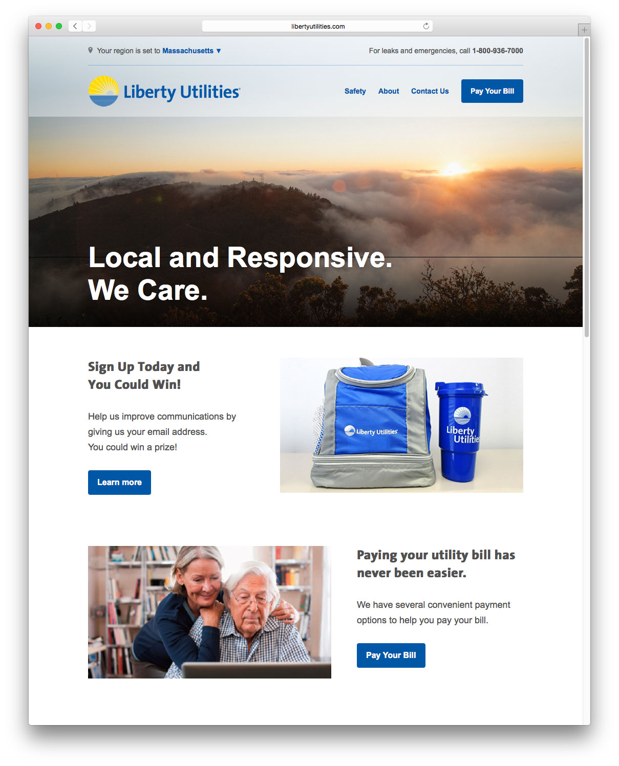

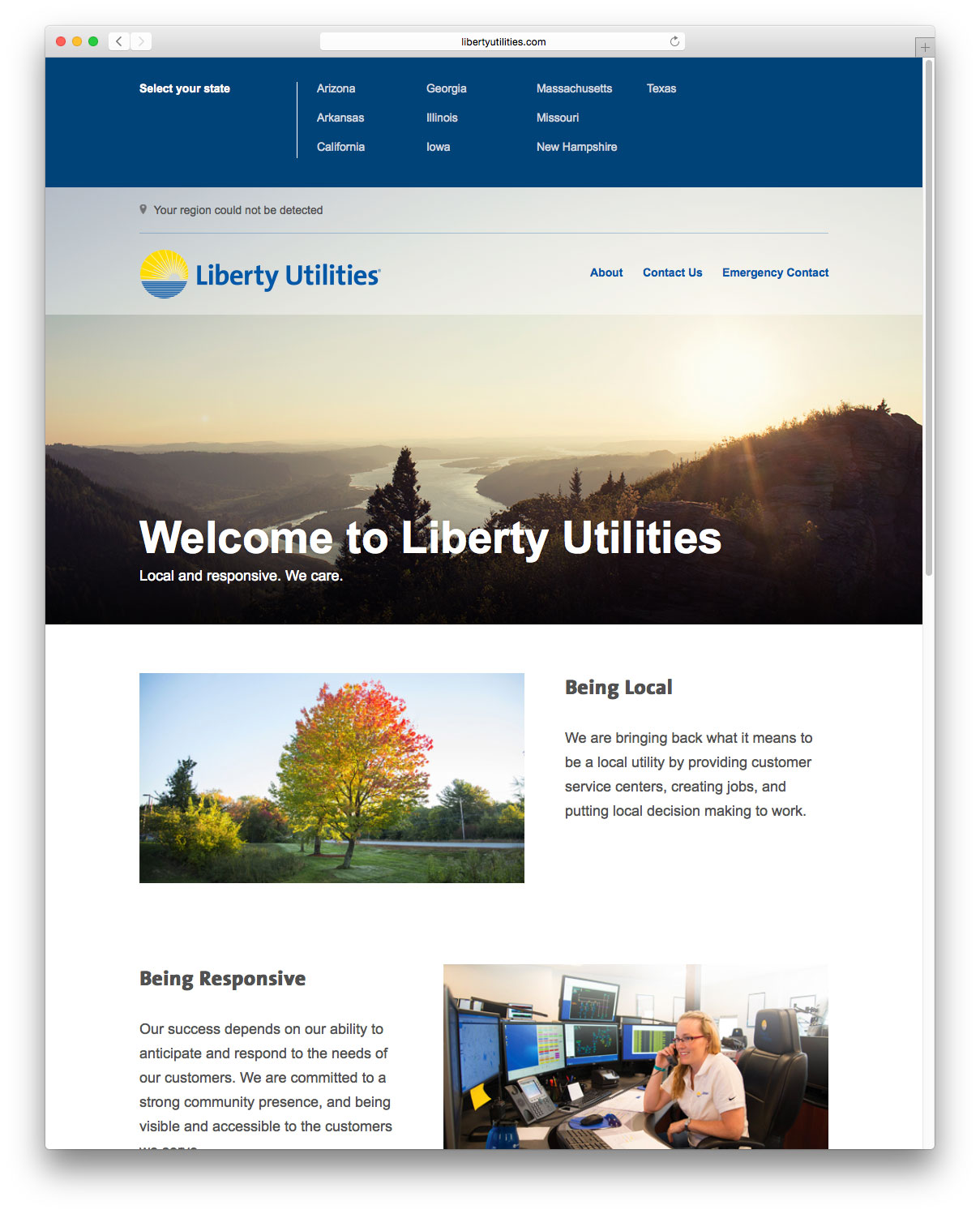

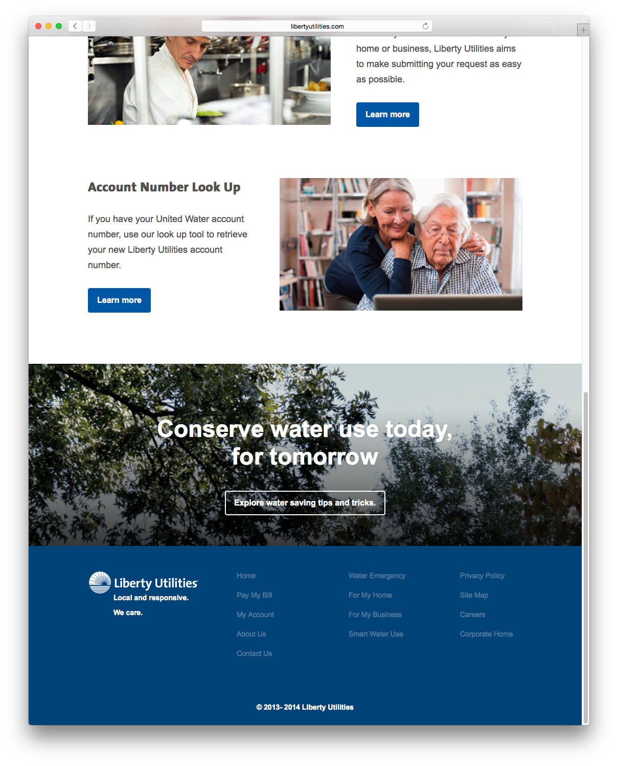

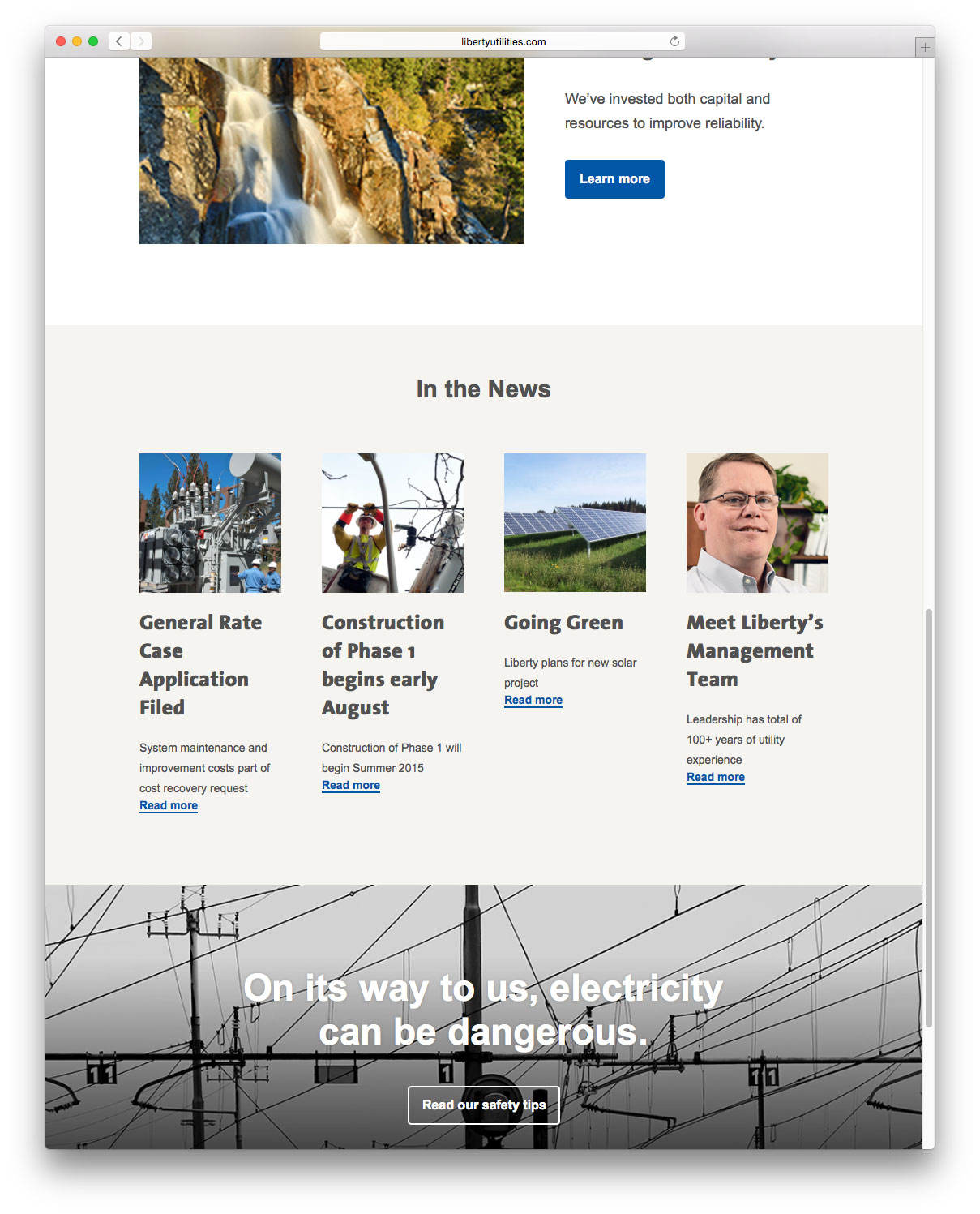

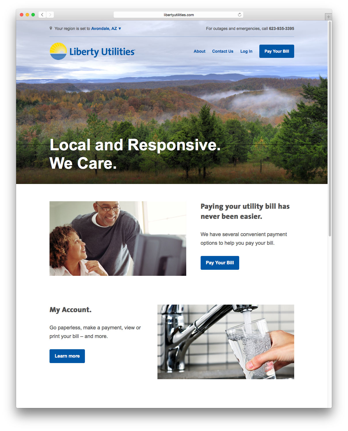

Selected homepages from across the various local utilities
For interior pages, we used a Javascript widget to inject new code into the site header, to provide a consistent simplified header (across both HTML and Drupal pages) which showcased the territory detection feature, simplified the primary navigation, and added emphasis on the revised Contact and Payment flows.
Takeaways
This work emphasized the need to combine long and short term planning, in order to set a clear strategic direction while ensuring that immediate (and ideally continuous) improvements align with the higher vision.
This project was also an excellent example of a collaborative team of specialist external partners helping to take an impartial audit of a client's existing services, working closely with internal teams to clearly articulate opportunities and goals, and designing a roadmap to achieve both internal business efficiencies and external, customer-facing service enhancements.
On a personal level, working with a client with a large existing client base was extremely gratifying. Seeing how small improvements to high-priority user flows rolled out at scale can make life easier for millions of customers was immensely gratifying.
NEXT PROJECT
Meta
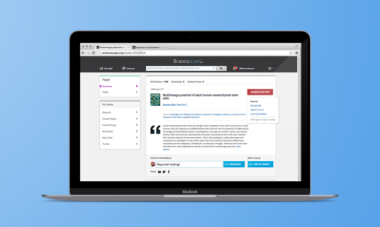
A platform to enable scientists to stream, discover, share, and manage their world of peer-reviewed academic research.
