Meta (formerly Sciencescape)
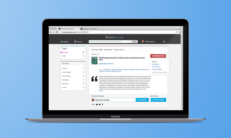
Meta (formerly Sciencescape) was designed from the ground up to accelerate the pace of scientific discovery. It was developed to address two critical issues faced by contemporary researchers: currency (how can I keep track of all the relevant new papers coming out in my field of study) and context (how can I understand how this new work fits into the existing research landscape).
As Head of Product Design I was the company's first employee, and was involved from the gestational phases of the product. I led the design, testing, and iteratation of preliminary versions of the platform, leading to a Series A round and wide public launch. As the company grew I wore many hats, and helped with everything from strategic visioning to F/E development, roadmap prioritization, fundraising, and community growth.
My Role
Head of Product Design
Please note: I was involved in Sciencescape from 2012-2014. The current version of the site reflects a continued evolution that I was not directly involved in. Screens on this page date to the period of my involvement.
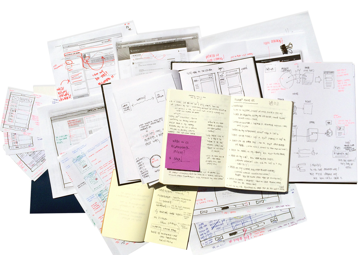
A small fraction of the studies, sketches, diagrams, wires, lists, testing notes, feature breakdowns, and designs produced over 2+ years with Sciencescape
Discovery
Following an ethos of user-centered design, I collaborated closely with the co-founders to help lead the preliminary discovery work & subsequent maturation of the platform through an intensive engagement with our user base.
As Head of Product Design, my duties included both strategic and hands-on product design, as well as product and project management.
I performed extensive competitive analysis, user testing, research, strategic product design, information architecture, iterative wireframe designs for testing, consensus building, UI/UX design, graphic design, pixel-perfect mockup generation, management of the design team through final implementation, and the tracking of user analytics to inform the ever-evolving product strategy and feature refinement.
"Sciencescape will … allow people to connect the dots, to make better hypotheses and ultimately lead to transformation of [government and health] services"
Chris O’Neill, managing director of Google Canada
An Introduction to Sciencescape
Sciencescape is designed for academics, professional researchers, and scientists. It is many things simultaneously, including:
- a new technology to parse published research using NLP & machine-learning techniques,
- an indexed archive of historic literature, and a predictor of impact for recently published papers,
- a new delivery channel to stream, tag, and organize published research,
- a powerful recommendation engine to deliver breaking, relevant research,
- a new platform to collaboratorate around research for both local and distributed teams, and
- a new way for companies to understand who is using their products, and what research trends to watch.
The video below was produced early in the life of the company, and introduces the platform:
The Plumbing
At a high level Sciencescape provides the plumbing to enable and accelerate the pace of scientific research. It's not sexy, but it's incredibly important. We were designing the platform at the convergence of need and possibility - even ten years ago the tech didn't exist in a mature enough state to allow us to build what we did, nor was the volume of breaking peer-reviewed research great enough to require a new distribution model.
Early on, we needed to focus on building a sustainable company, and that meant raising money. We worked hard to build a proof-of-concept prototype, and to demonstrate the size of the market, the problems we were solving, our team's unfair advantage in getting to market, the monetization potential of various revenue models, and building up a community of vocal advocates actively using the proof-of-concept.
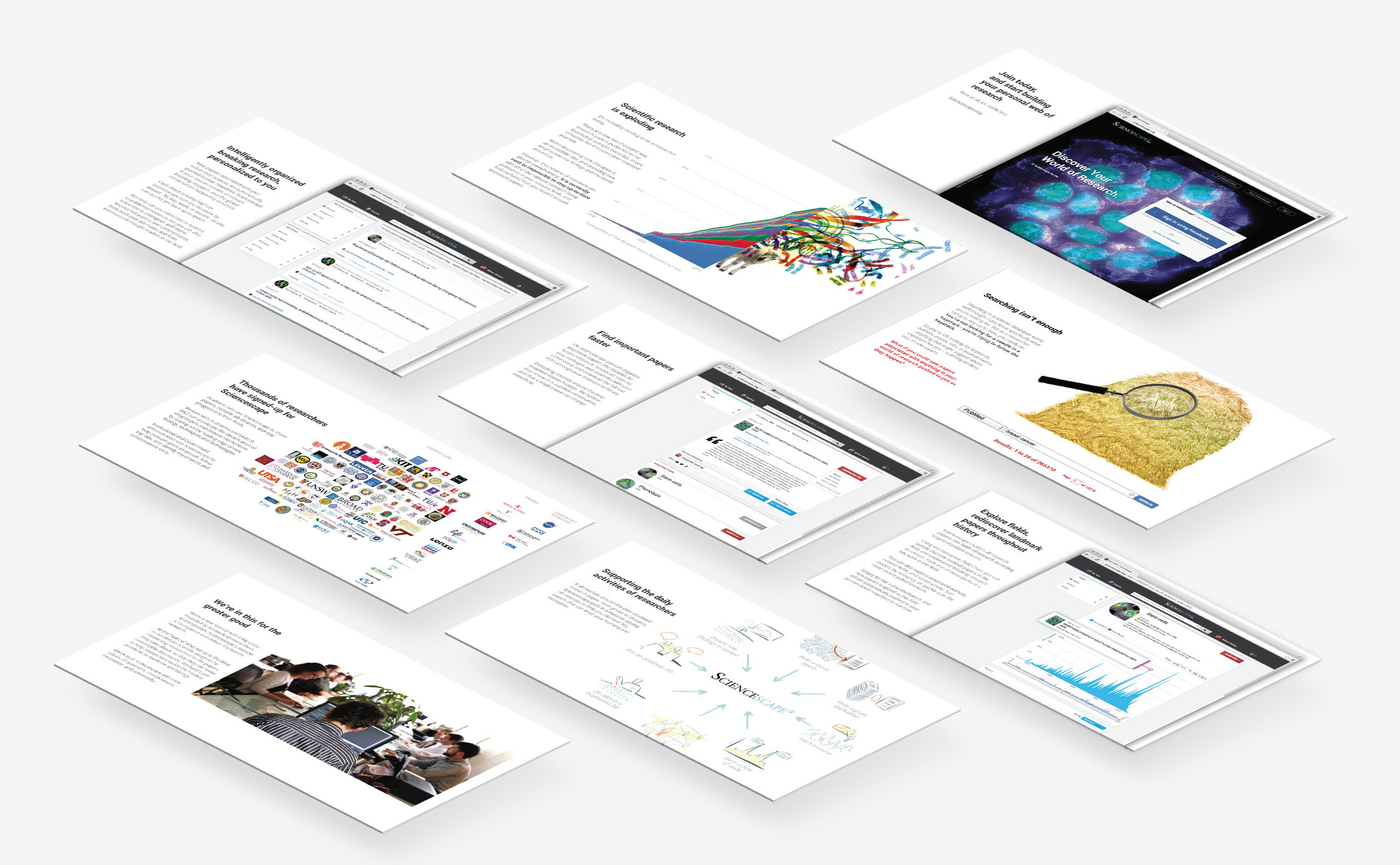

Sample screens from a later version of our Series A pitch deck that I designed
Once we had runway to build out a mature version of the platform, we focused heavily on community growth and new-user onboarding. We worked closely with lab groups at U of T and Harvard to test iterations of the product, and we quickly discovered that our biggest challenge was carefully balancing access to information in order to avoid the sensation of information overload. We spent a lot of time tuning the product design to optimally separate the signal from the noise.
Insights
Through the process of iterative prototyping and user testing, we focused on unpacking the feedback we received and extracting psycological insights that could help inform our product design decisions. For example: our core audience was very sensitive to any explicit or implicit suggestion that an algorithm was determining the importance or impact of new research - that was their job! The platform was most successful when it provided clear cues for the users to determine relevancy at a glance, allowing them to quickly skim the newest relevant papers without feeling overwhelmed, and yet be able to easily dive deeper to access and interact with the full literature.
It was also important for Sciencescape to remain laser-focused on the peer-reviewed research paper as the core of the whole platform, and not to publicly assign rankings or attempt to quantify the reputation of authors or institutes.
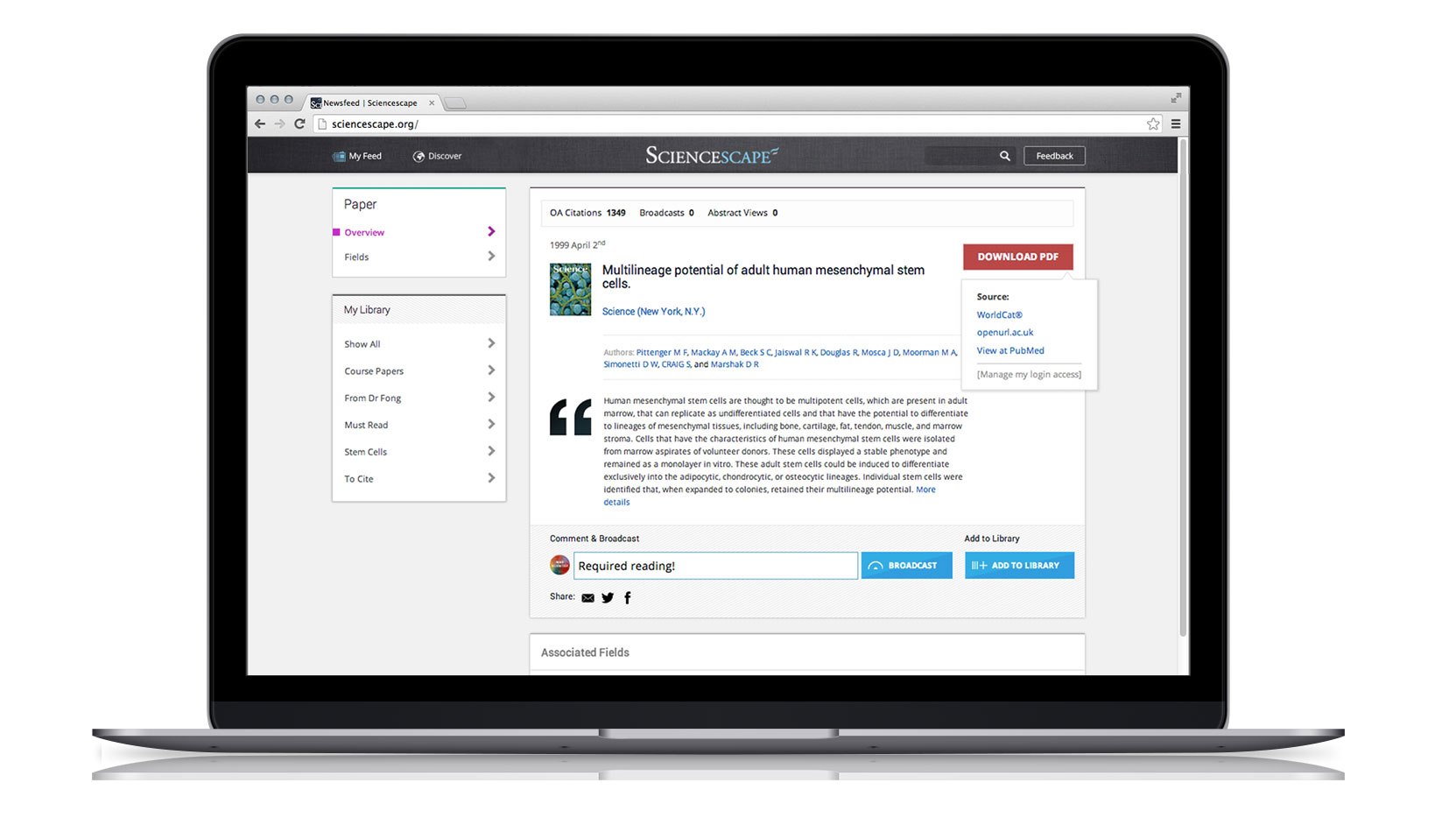

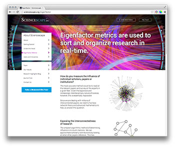

Measuring impact
Sciencescape uses Eigenfactor metrics to determine the impact of research
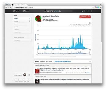

Interactive Field Charts
Explore the history of a field and quickly pick out seminal works
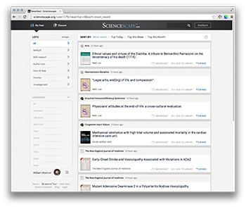

Your personalized feed
New papers from the fields, authors, journals, and institutes you follow as soon as they're published
We iterated on our core feature set repeatedly, testing low-fi prototypes with focus groups and split-testing variations that turned on or off certain elements to arrive at the leanest, most powerful tool. Data-driven design is extremely powerful, but you need to start with a solid grasp of the user, the use case, and the question you're trying to answer - data can inform us, but it cannot lead us.
The heart of the product is the back-end mapping and recommendation technology, and we built out a team of data scientists to work on both propriatary tech and industry-wide problems like author disambiguation and field taxonomies. We also worked with many bright students, and I led our intern program with U of T CompSci students focusing on mapping and NLP projects.
In our growth and outreach initiatives, we always sought to add value to the larger community. We ran a Journal Club program for students and a Research Highlights blog & newsletter that aligned with the core values of the company.
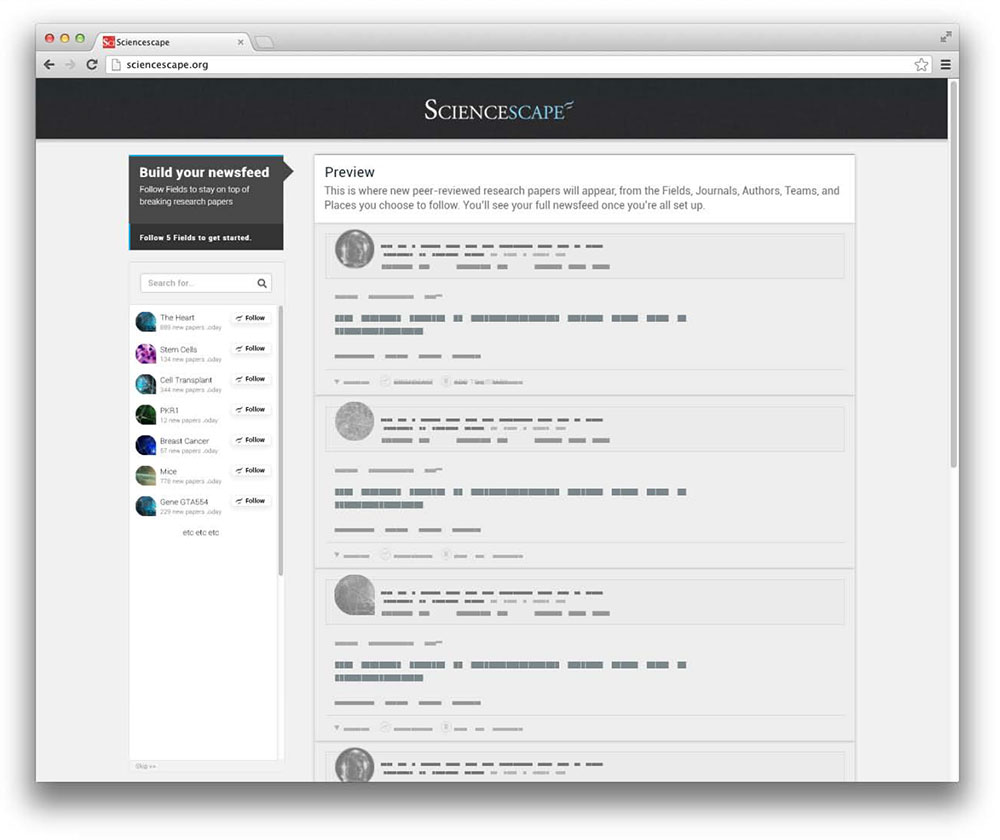

Interactive onboarding prototype
I produced numerous protytopes to test with our users, especially focusing on new user onboarding
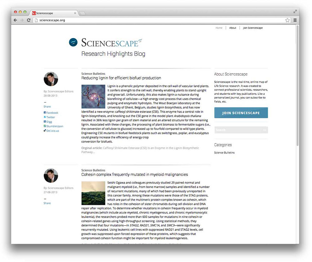

Research Highlights blog
In order to promote the site and position ourselves as respected thought-leaders in the field, we also produced a blog highlighting the week's top research stories
One Small Thing
Because of the size of our sample set, the complexity of the queries that the system would need to run, and the, er, economically-enforced humbleness of our processing power, users would often experience loading delays while scrolling their feed that could extend into the seconds.
Recognizing the limitations that we had to work with, I sought to transform that slight, repeated annoyance into an opportunity for delight. I adapted an image of a Western Blot test - familiar to everyone in our core audience - and added it as our infinite-scroll loading animation at the bottom of the page.


We started getting feedback that users would repeatedly scroll down to the next page over and over just to watch the animation pulse; the highest possible compliment!
Results
With initial support from MaRS and later guidance from the Extreme Startups accelerator program, we saw rapid community uptake and raised over $3M of pre-Series A funding, allowing us to grow the team to 18 data-scientists, developers, and sales associates in under two years.
24.5M
Papers indexed
1,000M
Paper to concept mappings
40min/mo
Avg user time on site
Each day, Meta (formerly Sciencescape) now streams thousands of relevant, breaking papers to scientists, clinicians, educators, and students around the world so that they can incorporate new ideas, findings, methods and technologies into their work.
Once the mature product was in market, the company's focus shifted from product to pure growth and business development. I found that I loved solving problems and building up the platform, but not so much designing page mockups for pharma company pitches. I took the momentum from Sciencescape and moved to a product role with TWG, where I could continue to learn and grow from their refined processes and collaborate with diverse teams of passionate folks.
NEXT PROJECT
[Leading North American Bank]
Digital tools for online investing and wealth management, across both the public site and secure apps.
